Color strategy for restorative interiors
Color, Perception & Nature Wall Art
Color influences attention, expectation, and emotional interpretation, but there is no universal formula in which one hue produces the same response in every person. Context matters: saturation, brightness, contrast, culture, memory, lighting, and the subject represented all change how a color is experienced.
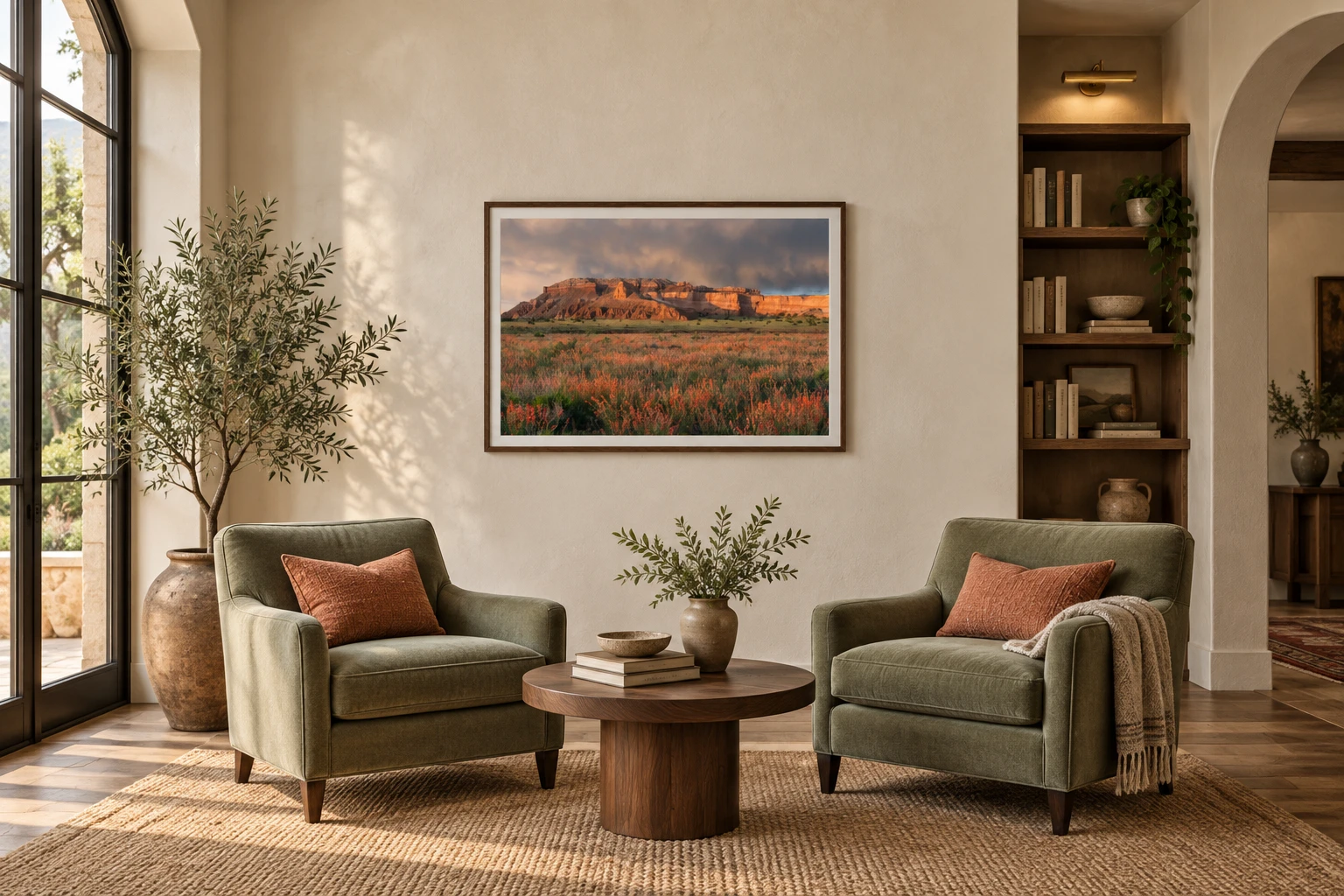
For commercial interiors, the useful question is not simply which color is calming. It is how the palette of a landscape photograph works with the room, its purpose, and the people using it. Nature photography lets blue, green, yellow, and warm earth color arrive through recognizable places rather than as isolated color fields.
Selection guidance
What matters when choosing artwork for this setting.
- 01
Blue and green
Often read as spacious or nature-associated, especially when they appear in water, sky, foliage, and atmospheric distance. Keep enough tonal variation that the image remains engaging.
- 02
Yellow and gold
High-visibility warm color can add lift and welcome. In busy settings, use it as sunlight, foliage, or flowers rather than allowing saturated yellow to dominate every surface.
- 03
Brightness and contrast
A hue cannot be judged alone. A dark blue storm image and a bright blue lake create very different impressions; value, saturation, and visual complexity are part of the decision.
What color research can and cannot tell us
A major review in the Annual Review of Psychology concluded that color can affect emotion, cognition, and behavior, while also warning that the field needs stronger evidence about context and real-world generalizability. That is a useful design boundary: color associations can guide a shortlist, but they should not be presented as guaranteed psychological outcomes.
Blue and green have received broadly positive ratings in cross-cultural color research, while yellow is frequently connected with brightness and activity. Those associations are starting points, not prescriptions. The same photograph can feel open in a daylight lobby, muted under cool fluorescent light, or overly active beside a patterned wall covering.
Regenerative color
Use green, yellow, blue, and visual openness with intention.
In restorative and regenerative interiors, color works best when it belongs to a believable natural scene. Green foliage, warm yellow light, blue distance, and open space give the viewer recognizable visual information rather than asking a single painted hue to carry the entire emotional burden.
The goal is not to prescribe a universal mood. It is to choose an image whose color, brightness, depth, and subject reinforce the experience the room is meant to support.
Living green
Forests, grasses, moss, and spring foliage can suggest growth, shelter, and continuity. Choose scenes with visible depth or a clearing so the green does not become dense or visually closed.
- Subjects & texture
- Look for layered tree trunks, translucent leaves, soft grasses, moss-covered stone, riverbanks, and forest openings. Fine leaf detail creates visual richness up close, while repeated trunks and larger bands of foliage keep the photograph organized from across a room.
- Specification
- Muted sage, olive, and blue-green photographs are easier to coordinate than uniformly saturated emerald green. In focus or recovery spaces, favor moderate contrast and a matte or luster surface; in a lobby, a brighter green landscape can carry more scale and energy.
Sunlit yellow
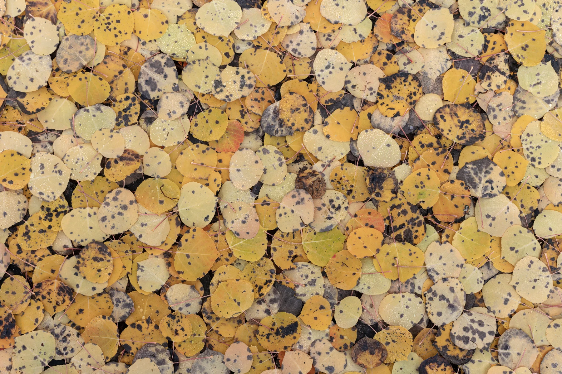
Wildflowers, aspens, and warm reflected light can add optimism and energy. Yellow is usually more comfortable as a natural accent within a balanced photograph than as a highly saturated field across the whole image.
- Subjects & texture
- Aspen leaves, meadow flowers, dry grasses, cottonwoods, and narrow bands of sunlight provide natural yellow with variation from lemon and chartreuse to ochre and gold. Their organic texture keeps the color from reading like a warning sign or a flat graphic field.
- Specification
- Use yellow where welcome, activity, or social connection matters, then balance it with green foliage, pale sky, neutral stone, or shadow. Large areas of intense yellow can become tiring under bright lighting, so review the image at final scale and under the room's actual color temperature.
Blue distance
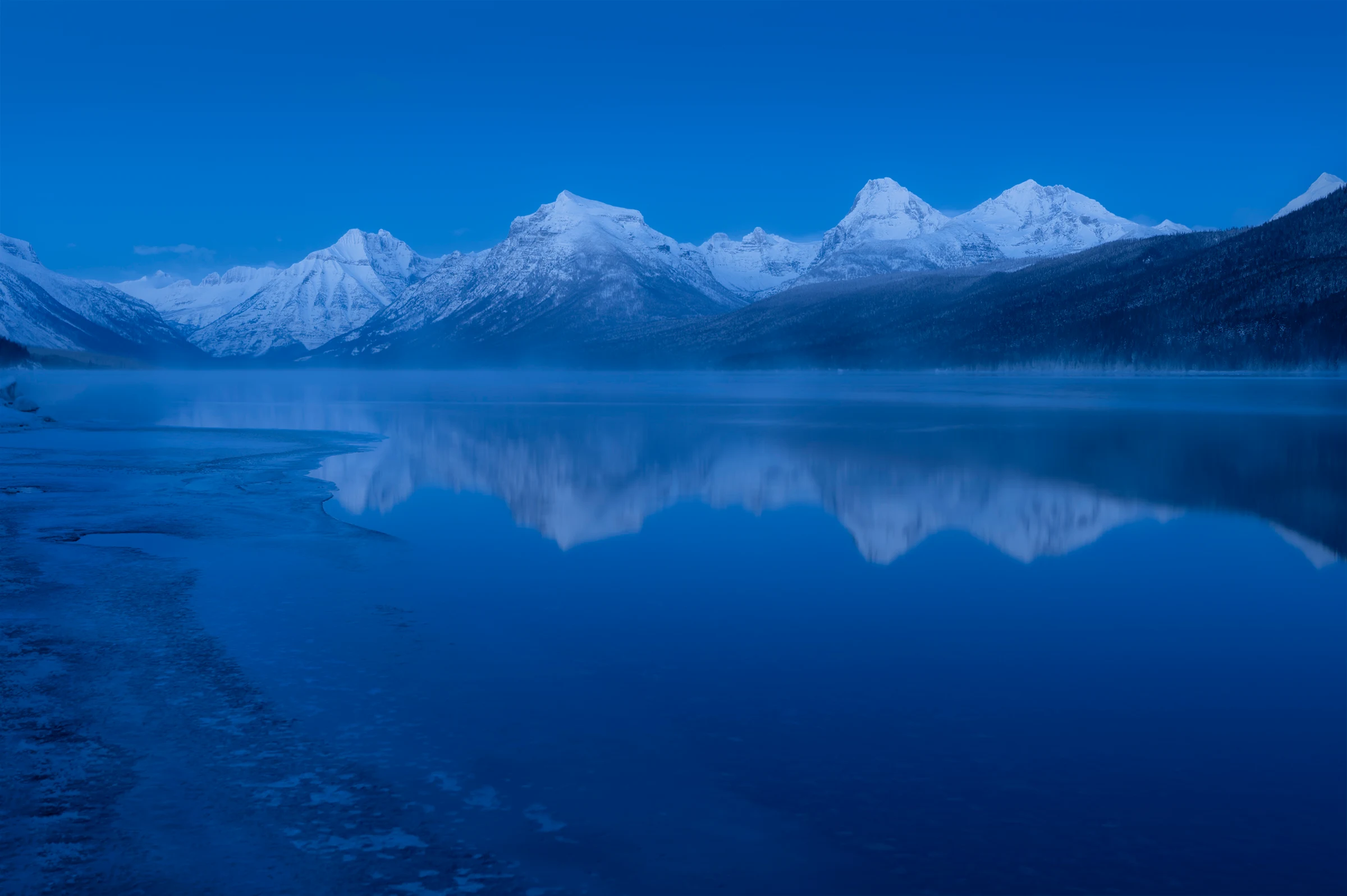
Open sky, water, mist, and distant mountains can make a confined room feel visually broader. Look for soft tonal transitions rather than dark storms or highly dramatic contrast in low-stimulation spaces.
- Subjects & texture
- Calm lakes, wide rivers, snow shadow, atmospheric mountain layers, and cloud-filtered sky create blue through depth rather than a single surface. Reflections and mist introduce gentle texture, while a visible shoreline or foreground gives the eye a stable point of entry.
- Specification
- Blue can shift cold under high-output or cool-white lighting. Choose photographs that contain warm rock, soft daylight, green vegetation, or restrained gold when the room already has gray floors and white walls. Avoid turbulent water and severe weather where reassurance is the goal.
Open visual space
A clear horizon, visible path, quiet water, or foreground-to-distance structure gives the eye somewhere to travel. Negative space can be as important as color when a room needs visual relief.
- Subjects & texture
- Open desert, snow fields, broad sky, calm shorelines, meadows, and distant ridges use fewer competing elements and larger areas of quiet tone. A path, stream, or gradual sequence of landforms can carry attention through the photograph without demanding effort.
- Specification
- This approach is useful on narrow walls, in windowless rooms, and wherever furniture or equipment already creates visual density. Preserve enough detail to reward a closer look, but avoid tiny, busy texture that disappears at the intended viewing distance.
Build a palette from the room outward
Begin with the room's fixed materials, available light, viewing distance, and desired level of stimulation. Then look for a landscape whose dominant and secondary colors create a deliberate relationship with those conditions. A green forest can echo wood and planting; a blue horizon can extend a narrow room; a restrained gold accent can warm a gray waiting area.
For multi-room projects, consistency does not require repeating one image. A family of photographs can share light quality, horizon structure, geographic region, or a limited palette while changing subject and scale from one zone to the next.
Practical placement
How to specify the artwork for the actual space.
- Healthcare and waiting areas
- Favor recognizable nature, moderate contrast, and palettes that remain comfortable under the facility's actual lighting.
- Offices and focus rooms
- Use quieter compositions where sustained attention is required; reserve brighter color and stronger contrast for social or transition spaces.
- Hospitality
- Connect color to the property's material palette and location so the art contributes to identity rather than reading as generic decoration.
- Large public walls
- Review the image at the proposed scale. Fine texture may disappear from a distance, while broad color relationships become more important.
Research sources
Evidence behind the guidance.
These peer-reviewed studies and reviews inform the page without turning artwork into a medical or performance promise. Individual responses, setting, lighting, culture, and research quality still matter.
- Color Psychology: Effects of Perceiving Color on Psychological Functioning in HumansAnnual Review of Psychology, 2014
- A Cross-Cultural Study of the Affective Meanings of ColorJournal of Cross-Cultural Psychology, 1973
- The Impact of Color in Healthcare Environments: A Systematic Review and Research AgendaShiraz E-Medical Journal, 2024