Waiting rooms, exam rooms, and outpatient care
Medical & Dental Office Wall Art
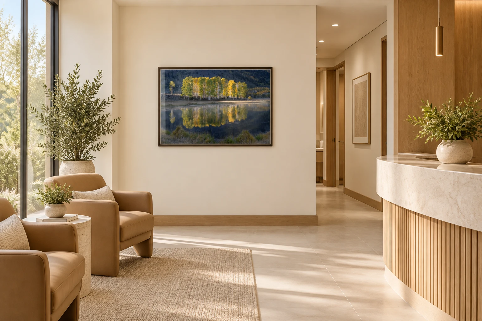
Medical and dental offices have a different rhythm from a hospital. Patients move among reception, waiting, consultation, imaging, and treatment rooms, often while anticipating an uncomfortable conversation or procedure. Thoughtful nature wall art can create continuity across those transitions and replace generic decoration with a recognizable visual identity.
The strongest approach is specific to each sightline. Artwork in a reception area has to welcome from a distance; a treatment-room image should be visible from the patient position; a corridor image should remain clear while people are moving.
Selection guidance
What matters when choosing artwork for this setting.
- 01
Design from the chair
Check what patients actually see while seated, reclined, or waiting for the clinician. A beautiful installation behind the patient offers little visual benefit during the visit.
- 02
Use familiar visual depth
Water, paths, layered hills, forests, and open sky can give the eye somewhere to travel without introducing a demanding narrative.
- 03
Coordinate without matching
Repeat frame, finish, and tonal family across the practice, then vary the landscape so rooms remain memorable and distinct.
Anxiety is contextual, and art selection should be too
Dental anxiety can begin before treatment, which makes the waiting and chair-side visual environment especially important. A randomized study in children found short-term reduction in anticipatory anxiety after viewing positive images of dentistry, illustrating that image content and audience matter. That study did not evaluate landscape art, so it should not be stretched into a claim that any nature photograph reduces dental anxiety.
For general medical and dental interiors, broader healthcare-art research supports patient preference for natural and representational scenes. Use that evidence as a reason to test recognizable nature imagery with patients and staff, not as a replacement for the practice's own feedback.
Anticipatory calm
Select color and subject from the patient's seated or reclined viewpoint.
Waiting and treatment rooms are experienced from fixed positions. A landscape should be selected for what the patient can actually see, how long they may see it, and how overhead or task lighting changes its color and reflection.
Soft green, blue, and warm daylight can help establish an approachable atmosphere, but the image's subject and contrast matter as much as its dominant hue.
Soft green depth
A meadow, river corridor, or forest opening provides natural green with enough depth to hold attention. Avoid compositions that become a flat wall of foliage from the treatment chair.
- Subjects & texture
- Suitable subjects include spring meadow, layered aspen trunks, a stream bordered by foliage, or a forest with light entering from beyond the trees. Repeated leaves and grasses offer soft texture, while a visible clearing keeps the scene spatial and easy to understand.
- Specification
- Use quieter green photographs in exam rooms, consultation rooms, and treatment spaces where they will be viewed at close range. More detailed forest work can suit reception and waiting areas. Verify that upholstery, cabinetry, and lighting do not push the green toward a harsh or artificial cast.
Blue without coldness
Water and sky can feel open, but blue-heavy imagery may become cold under clinical lighting. Look for warm stone, sunlight, or green vegetation to balance the palette.
- Subjects & texture
- Calm lake surfaces, pale sky, receding mountain ridges, and gentle reflections create visual depth. A warm shoreline, sunlit cloud, or band of green vegetation gives the composition material variety and prevents the photograph from becoming uniformly blue.
- Specification
- Blue works well opposite a dental chair, beside consultation seating, or in a compact waiting room where implied distance is valuable. Test the print under the same LED temperature used in the office, and choose low-glare presentation where task lights or windows face the artwork.
Gentle yellow accents
Flowers, grasses, or illuminated leaves can make reception and waiting areas feel more welcoming. Keep saturation controlled in smaller treatment rooms where the artwork is viewed at close range.
- Subjects & texture
- Wildflowers, autumn leaves, grasses, and warm daylight introduce yellow through small organic forms rather than a solid block of color. Botanical repetition gives a waiting viewer detail to explore, while broader areas of gold can create a stronger reception focal point.
- Specification
- Use brighter yellow in arrival and family areas where energy and welcome are appropriate; choose softer ochre, cream, and filtered gold near treatment chairs. Avoid highly saturated yellow beside warning labels, intense task lighting, or already-busy patterned finishes.
A clear place to look
A visible path, shoreline, clearing, or distant peak gives attention an easy route through the image. This is more useful than choosing a color while ignoring the composition.
- Subjects & texture
- Images with a simple foreground, readable middle distance, and open background are especially effective from a fixed chair. Paths, streams, shorelines, and repeated ridges create visual movement; quiet snow, sky, or water gives the composition room to breathe.
- Specification
- Position the primary subject inside the patient's natural field of view instead of centering the artwork only for someone entering the room. Check the view while seated and reclined, avoid placing the focal point behind equipment, and size the image so its structure remains legible from that distance.

Create a consistent outpatient experience
A small practice can feel cohesive with a tightly edited group of four to eight photographs. Consider a regional collection, one season, or a blue-green palette that moves from reception to treatment rooms. A larger clinic can assign a landscape family to each zone and use image titles or locations as memorable room references.
Specify durable mounting and verify cleaning requirements before production. Acrylic has a polished, contemporary presence but can reflect strong exam lighting; luster behind suitable glazing offers framing flexibility; canvas softens reflection but must fit the facility's cleaning and infection-control standards.
Practical placement
How to specify the artwork for the actual space.
- Reception
- Choose one clear statement image that establishes the practice's tone without competing with check-in information.
- Waiting room
- Mix a primary landscape with smaller related works at seated eye level; avoid overly dark or hazardous subjects.
- Dental treatment room
- Prioritize the patient's reclined view and glare conditions from the operating light.
- Medical exam room
- Use appropriately scaled art opposite the exam chair or table and keep required clinical information visually distinct.

Research sources
Evidence behind the guidance.
These peer-reviewed studies and reviews inform the page without turning artwork into a medical or performance promise. Individual responses, setting, lighting, culture, and research quality still matter.
- Evidence-Based Art in the HospitalWiener Medizinische Wochenschrift, 2021
- Viewing Positive Images of Dentistry Reduces Anticipatory Anxiety in ChildrenEvidence-Based Dentistry, 2007
- Undertaking an Art Survey to Compare Patient Versus Student Art PreferencesEnvironment and Behavior, 2008
- The Impact of Color in Healthcare Environments: A Systematic Review and Research AgendaShiraz E-Medical Journal, 2024