Artwork for patient, visitor, and staff spaces
Healthcare Wall Art & Nature Photography
Healthcare wall art has to serve more than an empty wall. Patients may be worried, fatigued, disoriented, or waiting without knowing how long the wait will be. Staff see the same corridors every day. Visitors need visual landmarks and moments of relief in an unfamiliar building.
Research on art in healthcare is promising but uneven. Reviews report frequent patient preference for recognizable nature and figurative scenes, while rigorous evidence for specific clinical outcomes remains limited. The responsible goal is therefore to support comfort, attention, and a more humane experience, not to claim that a print can treat illness.
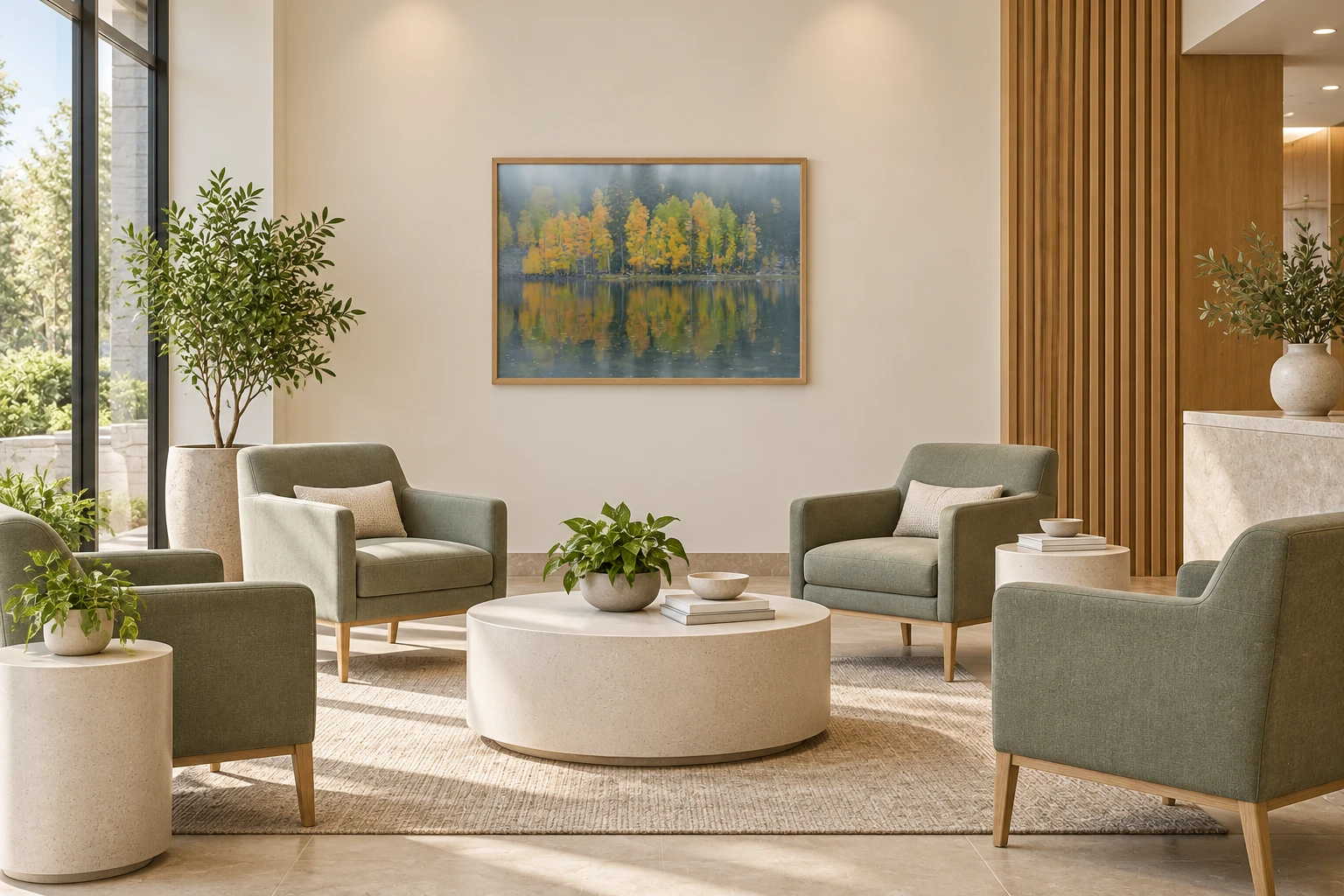
Selection guidance
What matters when choosing artwork for this setting.
- 01
Recognizable nature
Landscapes with clear depth, vegetation, water, or an open horizon are generally easier to interpret than ambiguous or threatening imagery.
- 02
Audience before trend
Pediatric, oncology, rehabilitation, senior-care, and behavioral-health settings have different users and sensitivities. Curate for the actual population.
- 03
Material matters
Specify surfaces, glazing, mounting, edge conditions, and cleaning requirements with the facility team. Low-glare viewing is especially important under bright clinical lighting.
Nature imagery as a positive visual distraction
A foundational 1984 hospital study found that matched surgical patients with a window view of trees had better outcomes on several measures than patients facing a brick wall. That study concerned a real window view, not artwork, so it should not be used to promise the same effect from a photograph. It did, however, help establish the importance of the visual environment in healthcare design.
Later reviews of evidence-based hospital art found that patients often prefer natural and representational scenes and that visual art can support reported wellbeing and behavior. The quality and consistency of studies vary, which is why image selection, placement, and local evaluation still matter.
Regenerative health
Use yellow, green, blue, and open space to make care environments feel more supportive.
Here, regenerative describes the character of the environment: a space that feels connected to life, daylight, growth, and renewal. It is a design objective, not a claim that wall art provides medical treatment.
For hospitals and clinics, the strongest images combine approachable color with recognizable nature and clear spatial structure. They should be evaluated from the patient's actual viewpoint and under the facility's real lighting.
Healthy greens
Green foliage can carry associations with living systems, growth, and shelter. Favor healthy vegetation, layered trees, river corridors, or meadows with openings rather than dark, tangled forests that may feel enclosed.
- Subjects & texture
- Strong healthcare subjects include a meadow leading toward trees, a stream moving through green vegetation, spring leaves lit from behind, and layered forest with a visible clearing. Repeated trunks and leaf patterns offer gentle complexity, while open ground prevents the scene from becoming claustrophobic.
- Specification
- Green works well in patient rooms, rehabilitation areas, staff respite rooms, and longer-wait spaces where people have time to notice detail. Select a low-glare finish under bright clinical lighting, and avoid oversaturated green that can shift unnaturally beneath cool LEDs.
Warm yellow light
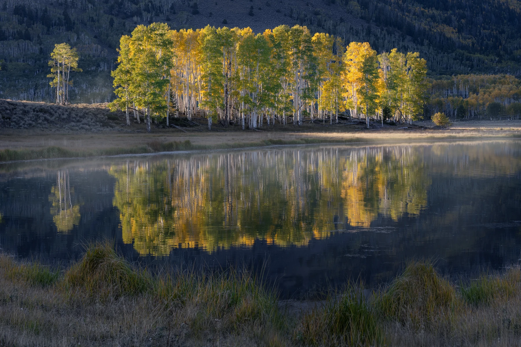
Sunlit grasses, wildflowers, and golden leaves can bring warmth to gray or highly clinical rooms. Use yellow as a measured source of brightness, especially in active waiting, rehabilitation, or family spaces.
- Subjects & texture
- Choose aspen leaves, wildflower fields, illuminated grasses, or a warm clearing within a cooler landscape. Fine botanical texture can hold attention during a wait, while broad areas of soft gold remain legible from a corridor or reception desk.
- Specification
- Yellow is most effective as a source of light within the image rather than an overpowering dominant hue. Use it to warm family waiting, pediatric-adjacent, rehabilitation, or social areas; in patient rooms and exam spaces, balance it with green, white, blue, or neutral earth color.
Blue and breathing room
Water, sky, mist, and distant ridgelines can create a sense of visual release in windowless or confined areas. Moderate brightness and low-threat weather are more appropriate than turbulent water or severe storms.
- Subjects & texture
- Calm water, a stable shoreline, pale sky, soft snow shadow, and receding mountain layers create spatial depth without a demanding narrative. Mist can soften detail, but the scene should retain enough structure that viewers immediately understand what they are seeing.
- Specification
- Blue landscapes suit windowless waiting rooms, imaging areas, consultation spaces, and narrow corridors where visual distance is limited. Check that the room's light does not turn the image gray or cold, and avoid crashing waves, lightning, deep night, or storm fronts in already stressful settings.
Prospect without hazard
Choose an image with an open view, understandable depth, and a stable place for the eye to rest. Avoid exposed cliffs, wildfire, violent weather, or compositions that imply danger or disorientation.
- Subjects & texture
- Useful subjects include a navigable trail, meadow opening, calm river bend, broad valley, distant mountain, or sheltered view toward an open horizon. Foreground, middle distance, and background should read clearly so the image feels spatial rather than flat.
- Specification
- Use these compositions where patients may face the same wall for an extended period, including infusion, recovery, waiting, and examination rooms. Review the work with facility stakeholders and representative users, since age, culture, condition, and personal experience can change how a landscape is interpreted.

Curate a system, not a stack of unrelated pictures
Start with the emotional intensity and function of each zone. Patient rooms may benefit from quieter compositions visible from the bed. Corridors need images that remain legible in motion and can become memorable landmarks. Staff respite areas can support more visual depth and detail because viewers have time to look closely.
A coherent collection can be built around regional landscape, season, water, forest, or mountain environments. Repeating a common frame profile and print finish creates order while varied imagery prevents the facility from feeling institutional or monotonous.
Practical placement
How to specify the artwork for the actual space.
- Patient rooms
- Check the view from the bed and chair, avoid disturbing or visually confusing subjects, and account for reflections from windows and overhead lights.
- Waiting rooms
- Use images with enough detail for a longer look while keeping the subject legible, familiar, and low in perceived threat.
- Corridors
- Select strong silhouettes or color landmarks that can help distinguish zones without competing with required wayfinding.
- Staff respite areas
- Consider immersive landscape depth, regional familiarity, and artwork that offers a genuine visual change from the clinical environment.
Research sources
Evidence behind the guidance.
These peer-reviewed studies and reviews inform the page without turning artwork into a medical or performance promise. Individual responses, setting, lighting, culture, and research quality still matter.
- View Through a Window May Influence Recovery from SurgeryScience, 1984
- Evidence-Based Art in the HospitalWiener Medizinische Wochenschrift, 2021
- Visual Art in Hospitals: Case Studies and Review of the EvidenceJournal of the Royal Society of Medicine, 2010
- The Impact of Color in Healthcare Environments: A Systematic Review and Research AgendaShiraz E-Medical Journal, 2024