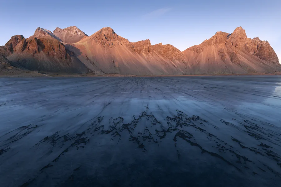
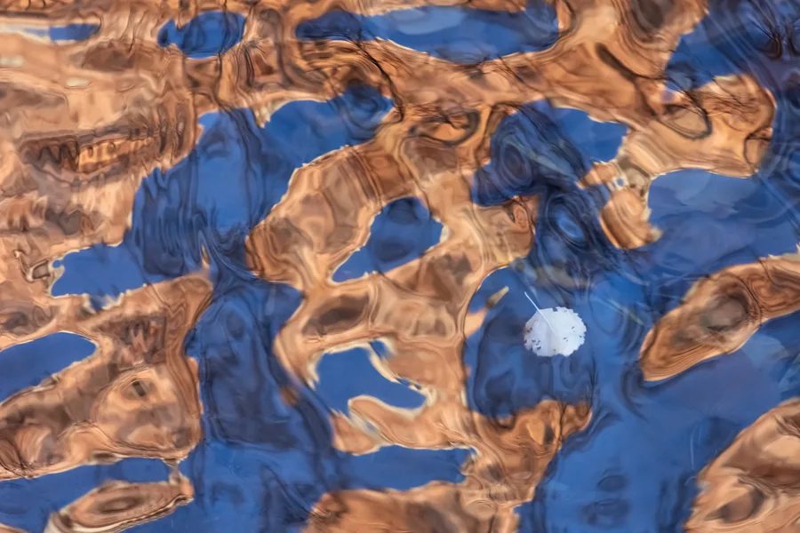
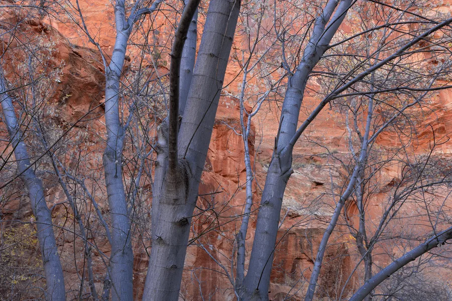
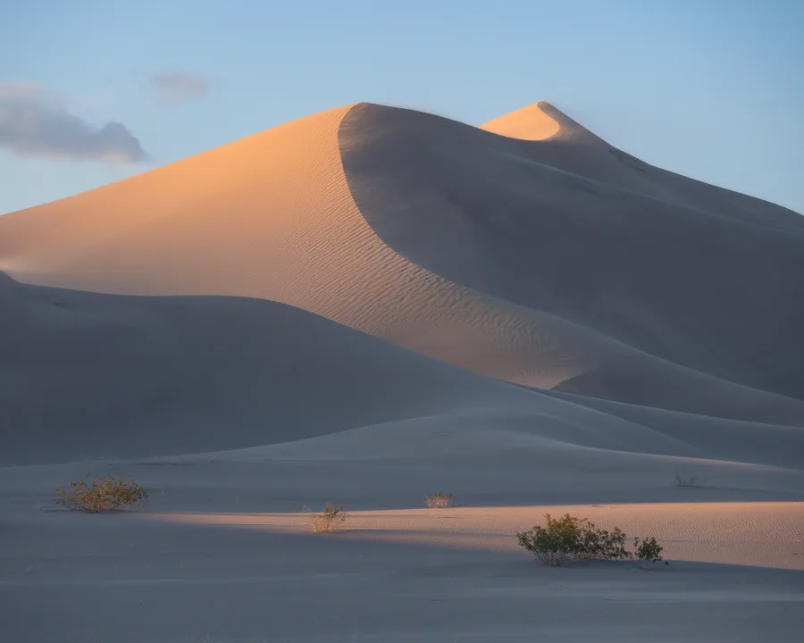
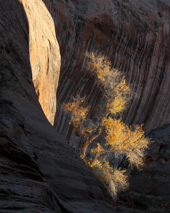
Calm and reassurance
Cool blues, greens, mist, water, forests, and snow can soften anxiety and create a more settled atmosphere.
Search cool tonesSearch by color, subject, mood, or detail
Search by color, subject, season, texture, or atmosphere to discover photographs that fit the space and feeling you have in mind.
Matching private search keywords for orange.
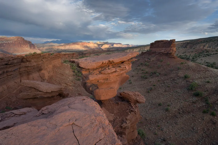
Capitol Reef National Park, Utah. 2025
Southwest Desert
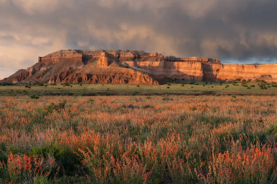
Capitol Reef National Park, Utah. 2023
Southwest Desert
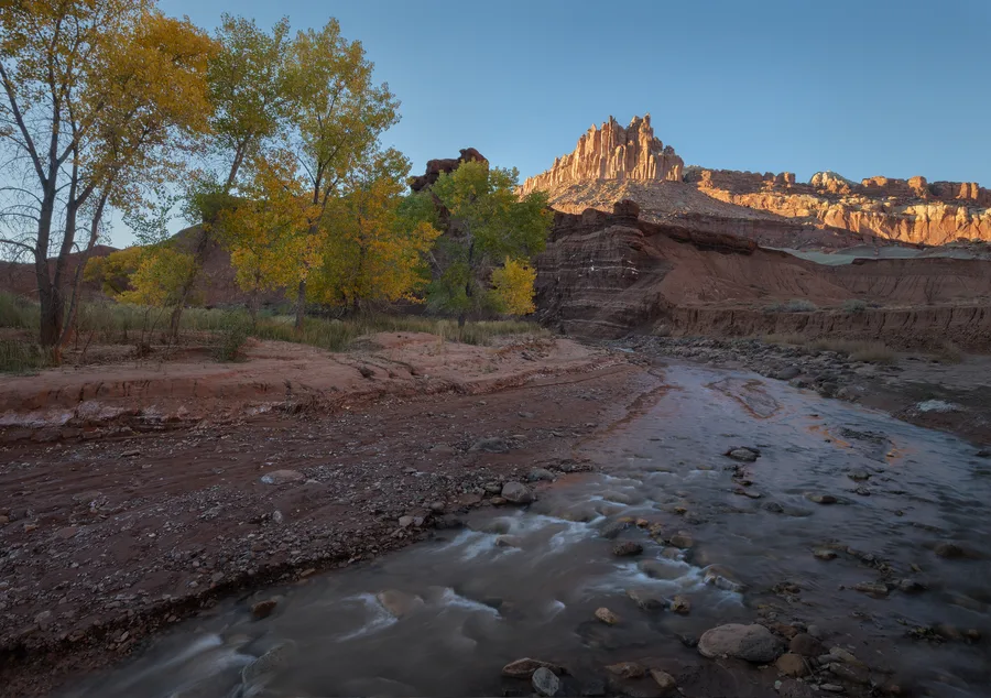
Capitol Reef National Park, Utah
Southwest Desert
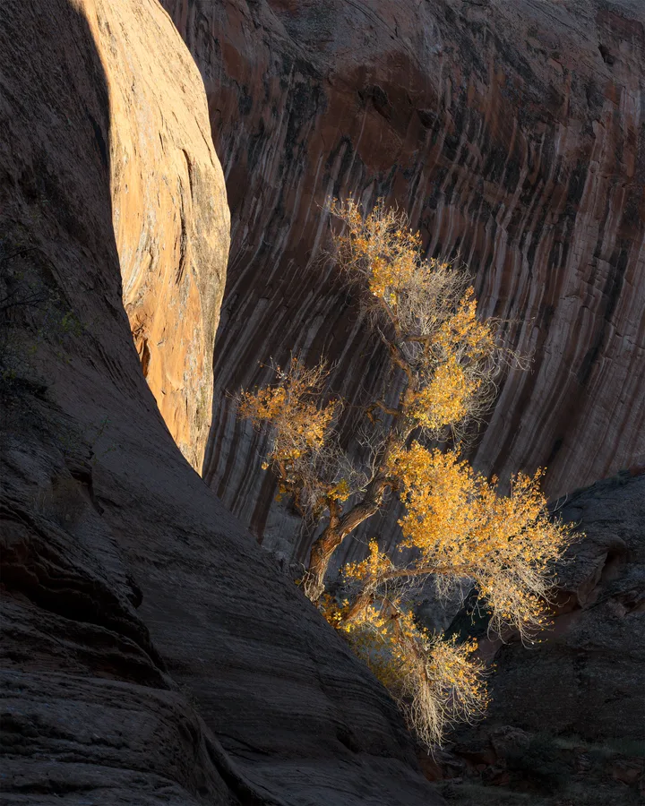
Escalante
Best Selling Prints
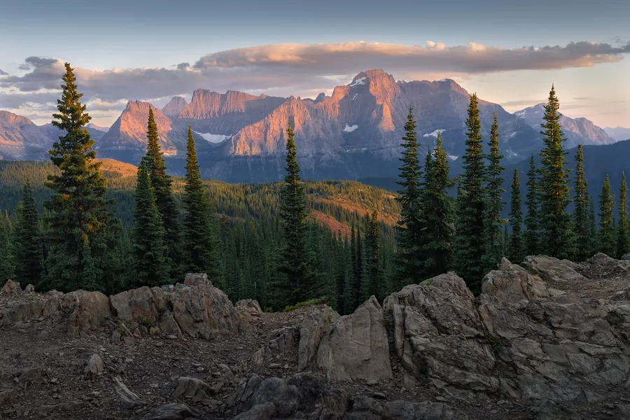
Glacier National Park, Montana
Mountain Landscapes
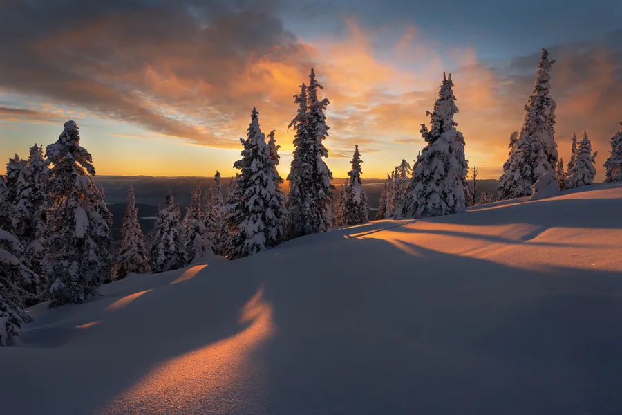
Whitefish Mountain, Montana. 2020
Winter Scenes
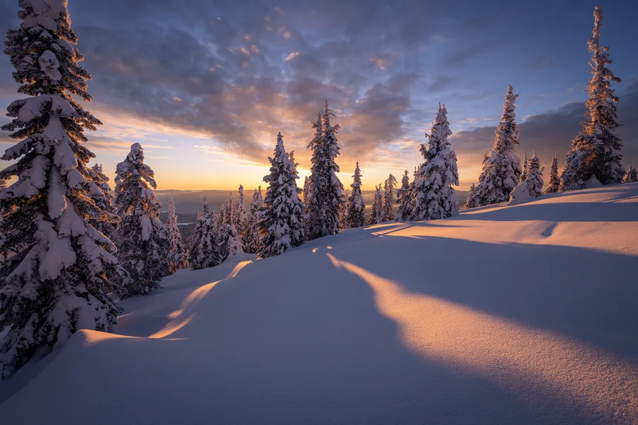
Whitefish Mountain, Montana. 2020
Winter Scenes
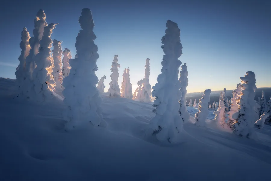
Whitefish Mountain, Montana. 2021
Winter Scenes
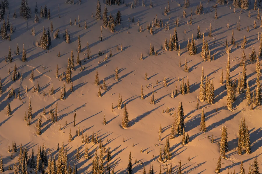
Whitefish Mountain, Montana.
Winter Scenes
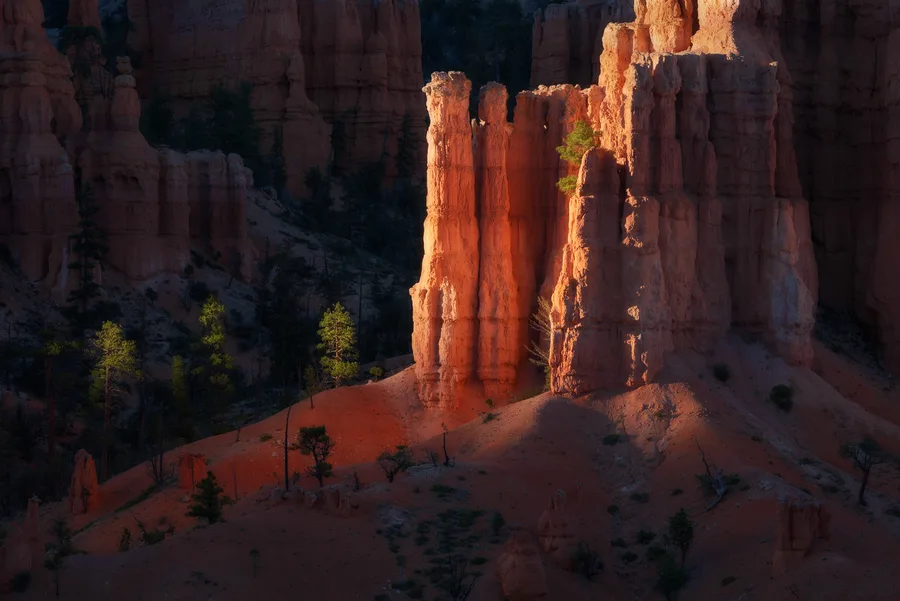
Bryce Canyon National Park, Utah.
Southwest Desert
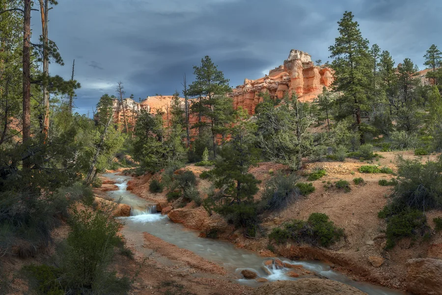
Bryce Canyon National Park, Utah. 2019
Southwest Desert
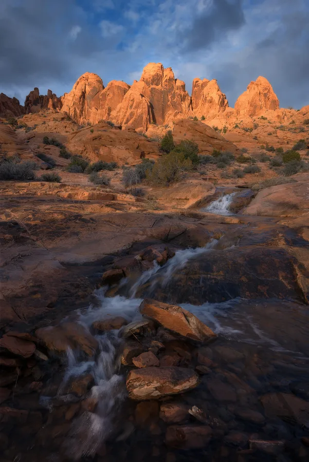
Moab, Utah. 2019
Southwest Desert
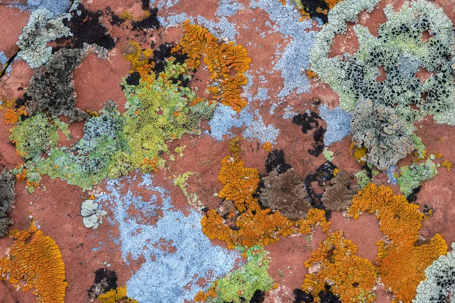
Moab, Utah. 2018
Intimate Scenes
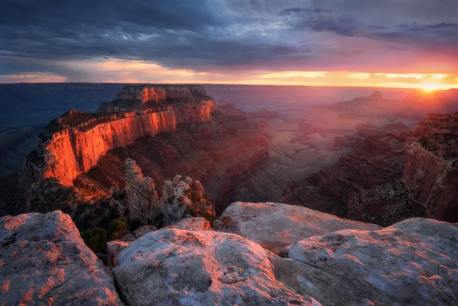
Grand Canyon National Park, Arizona – 2019.
Southwest Desert
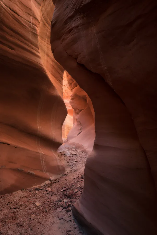
American Southwest, USA – 2019
Southwest Desert
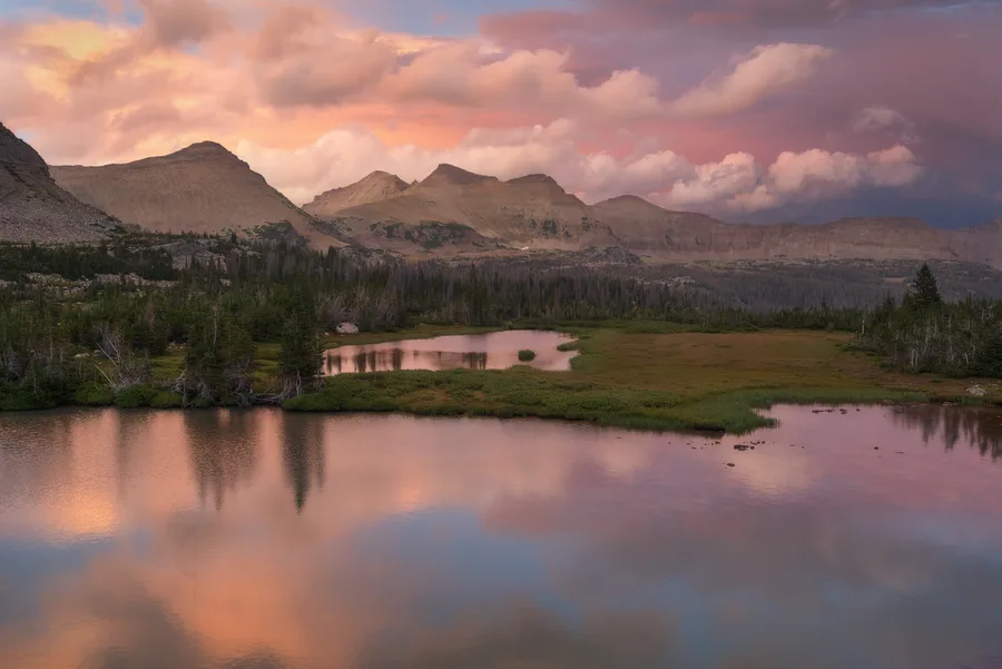
High Uinta Mountains, Utah
Mountain Landscapes
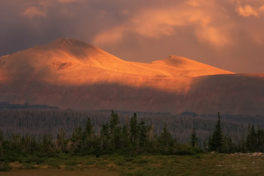
High Uintas Wilderness, Utah. 2018
Mountain Landscapes
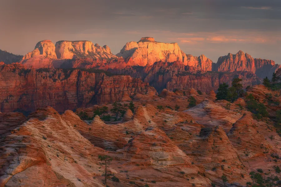
Zion National Park, Utah. 2019
Southwest Desert
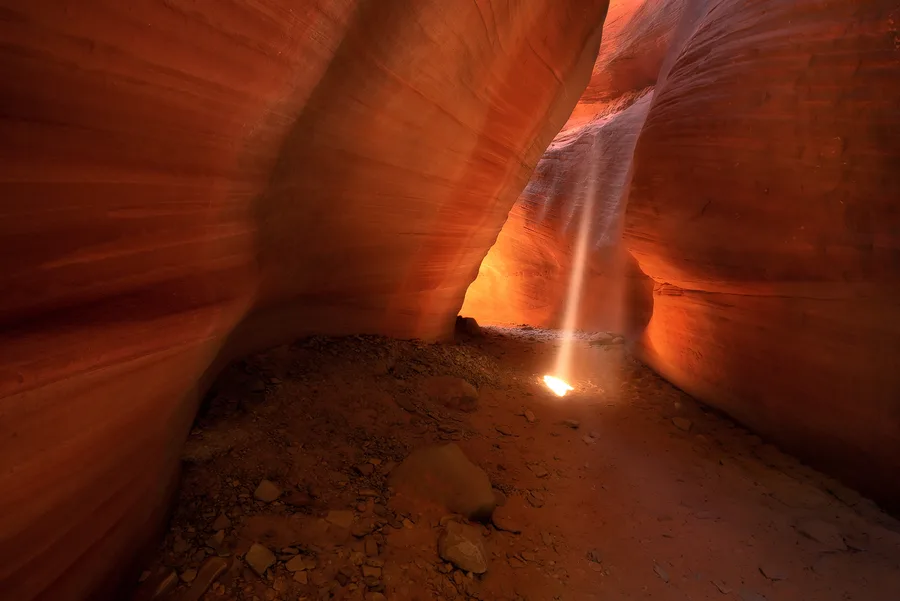
Kanab, Utah
Southwest Desert
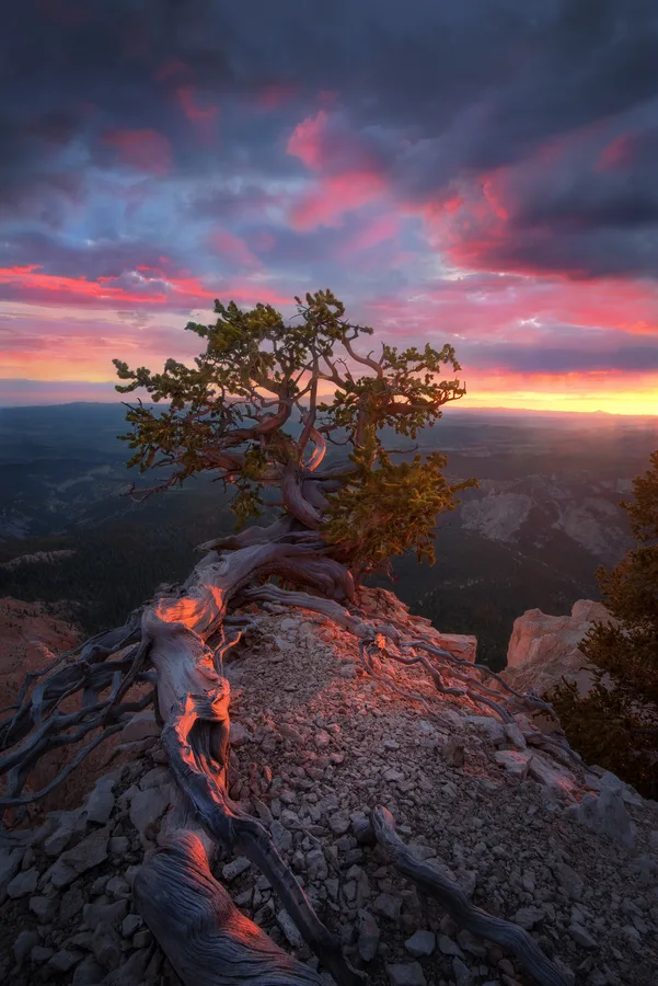
High Platues
Southwest Desert
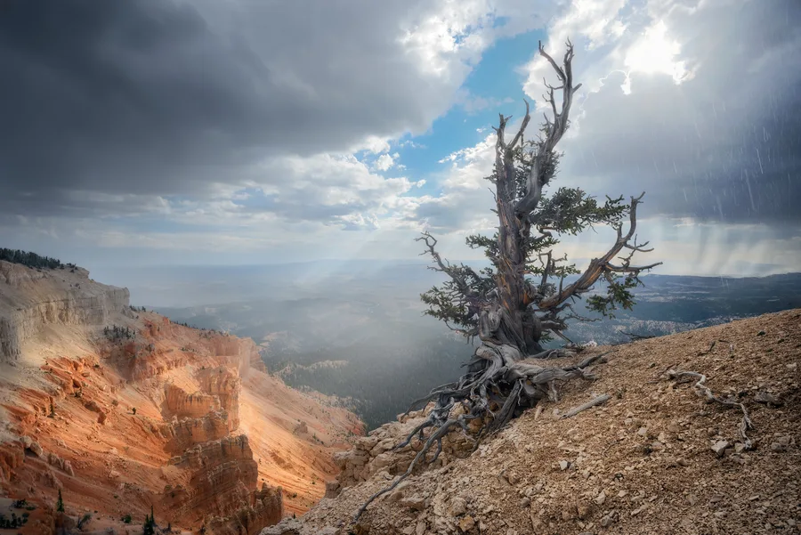
Southern Utah. 2019
Southwest Desert
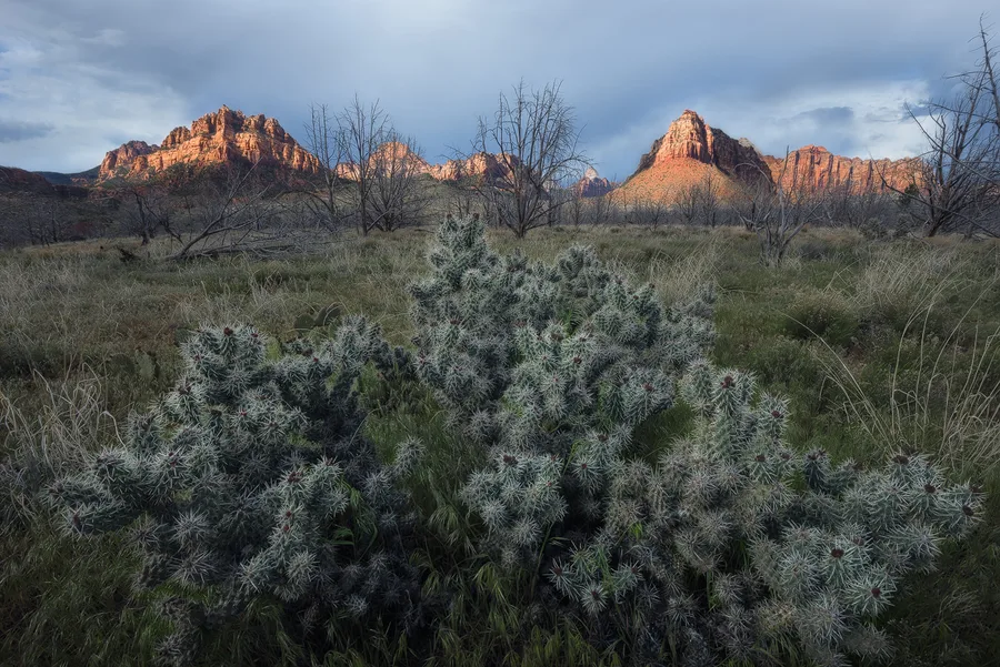
Zion National Park, Utah. 2019
Southwest Desert
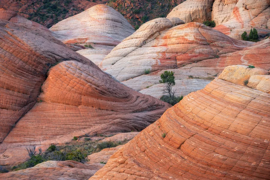
Utah Southwest. 2019
Southwest Desert
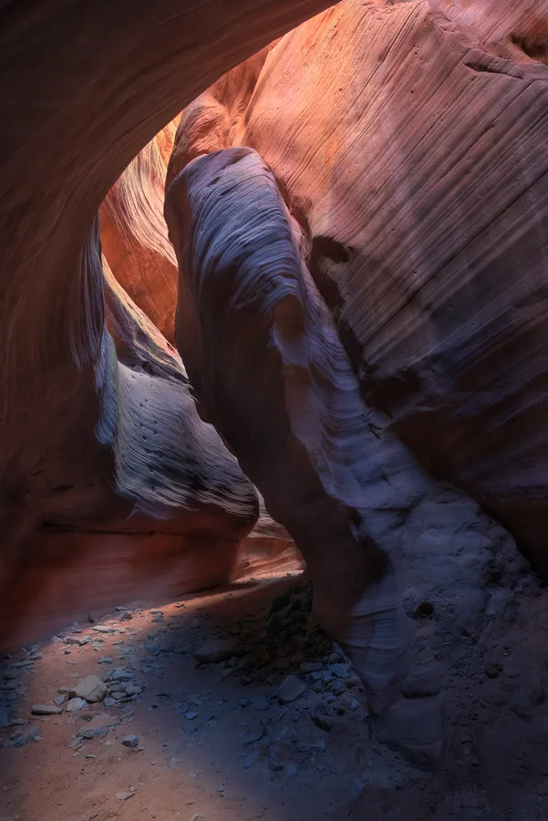
Utah Southwest. 2019
Southwest Desert
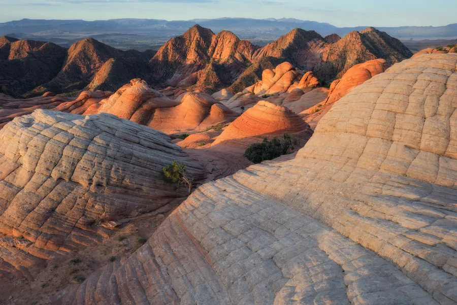
Utah Southwest – 2019.
Southwest Desert
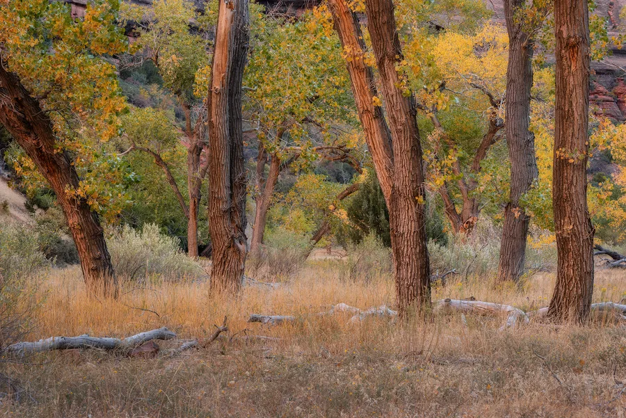
Zion National Park, Utah. Fall 2019
Autumn Colors
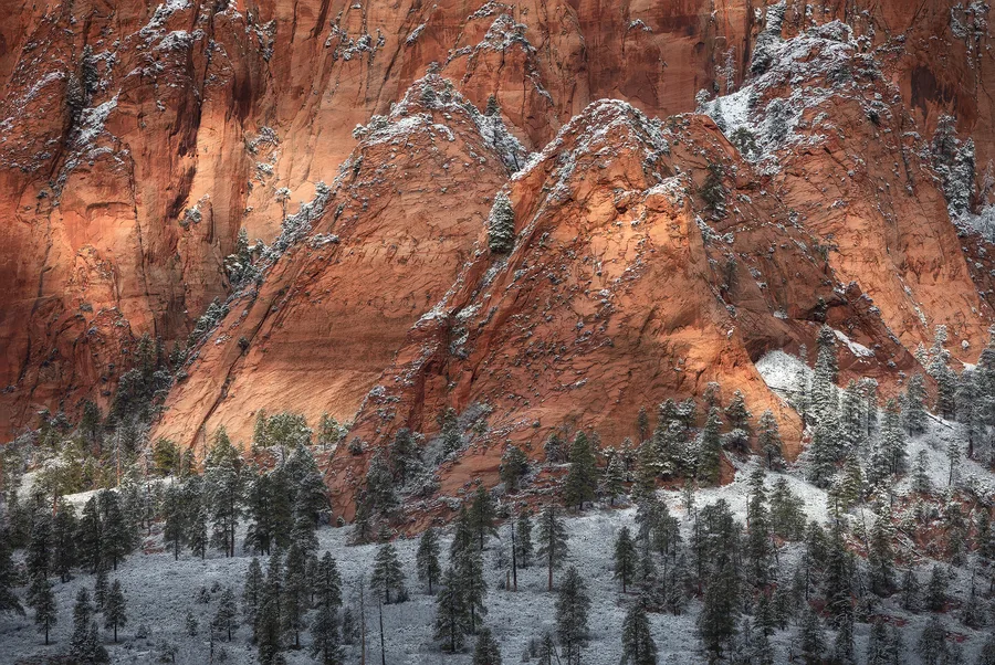
Zion National Park, Utah. 2020
Winter Scenes
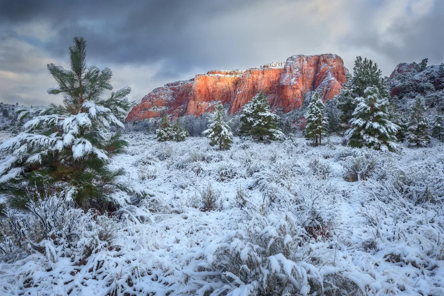
Zion National Park, Utah. 2020
Winter Scenes
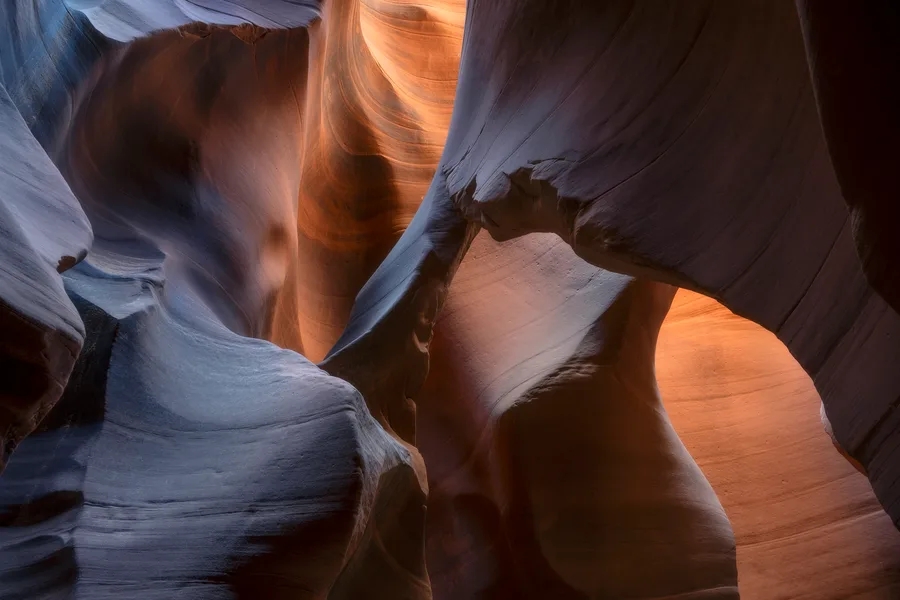
Southern Utah Slot Canyon. 2026
Silent Echoes
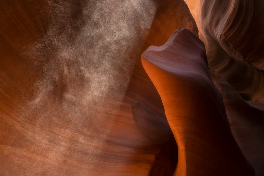
Southern Utah Slot Canyon. 2026
Silent Echoes
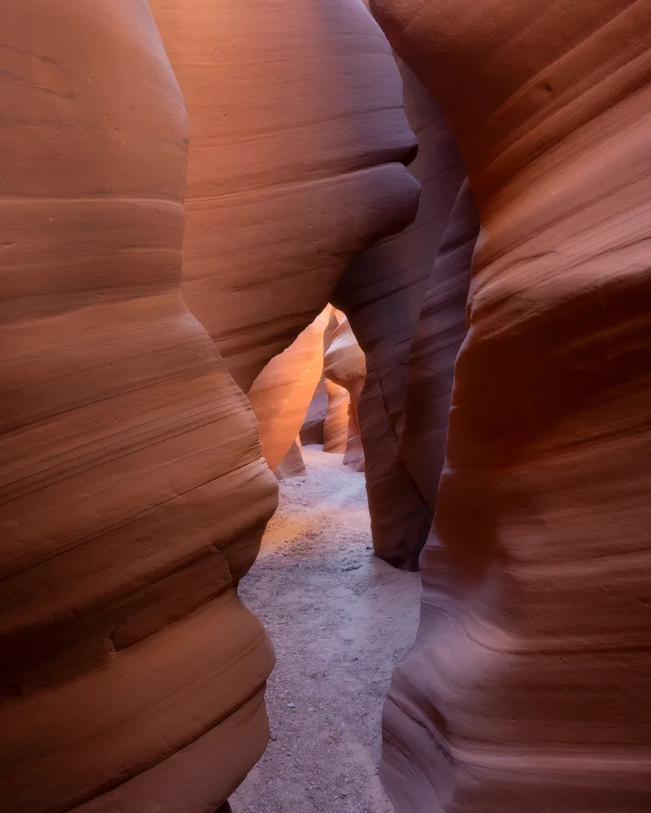
Southern Utah Slot Canyon. 2026
Silent Echoes
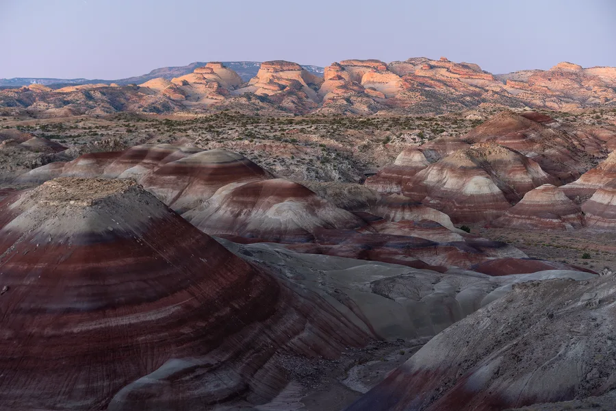
Southern Utah. 2025
Southwest Desert
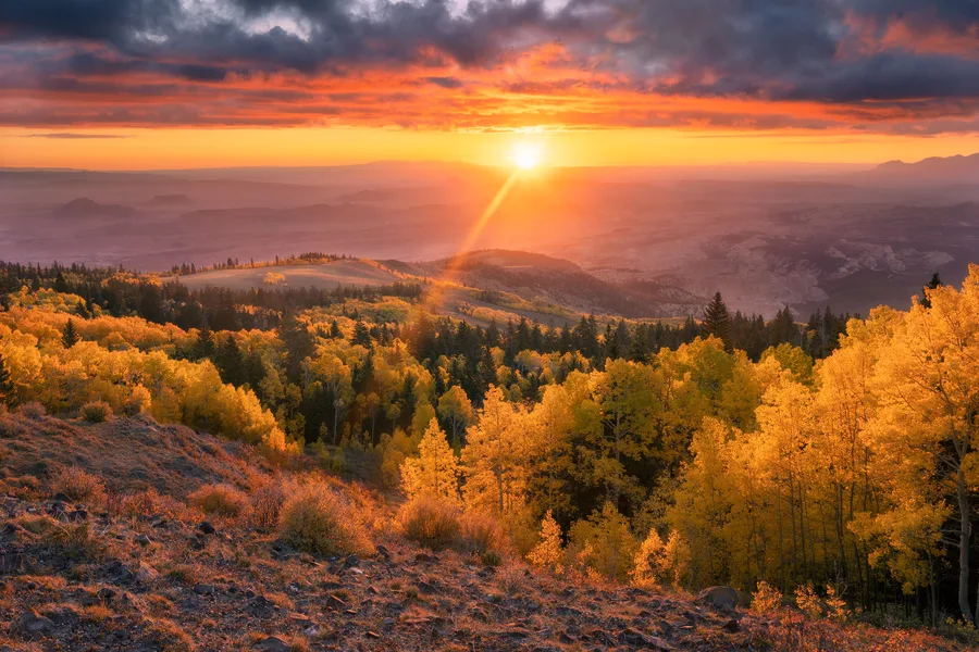
Fishlake National Forest, Utah. 2023
Autumn Colors
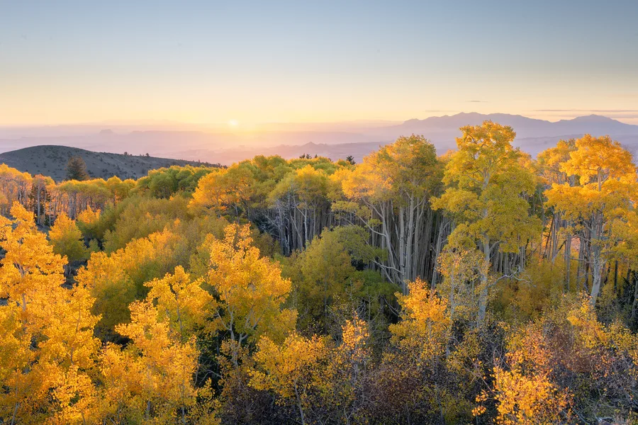
Southern Utah. 2023
Autumn Colors
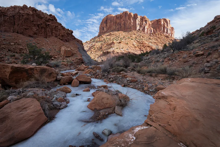
Moody Wilderness, Utah. 2022
Southwest Desert
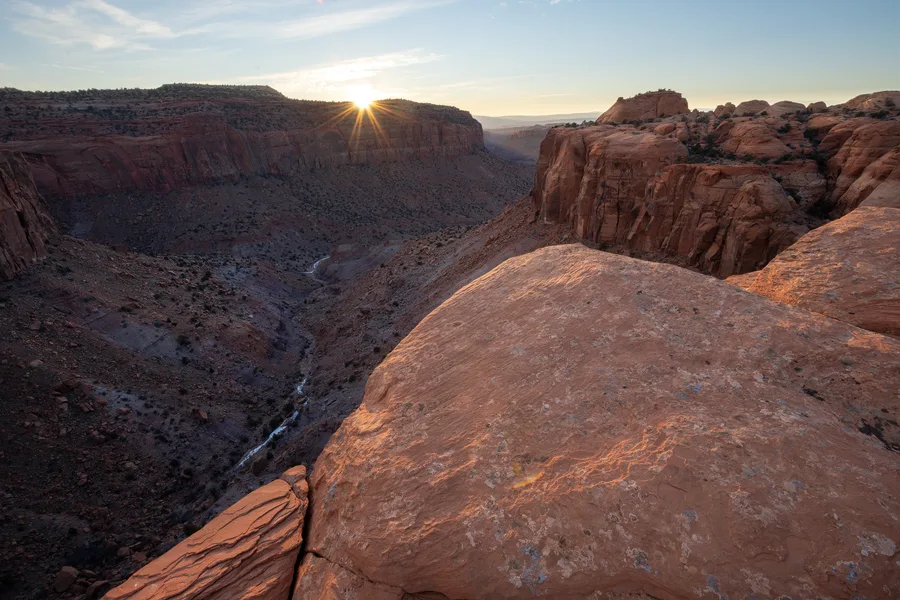
Wilderness - Canyon Country, Utah. 2022
Southwest Desert
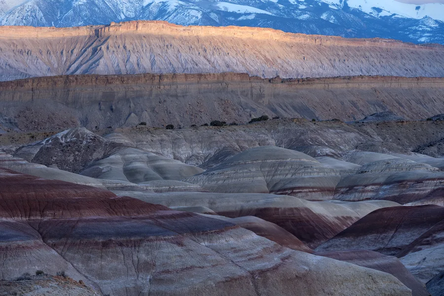
Bentonite Hills, Utah
Southwest Desert
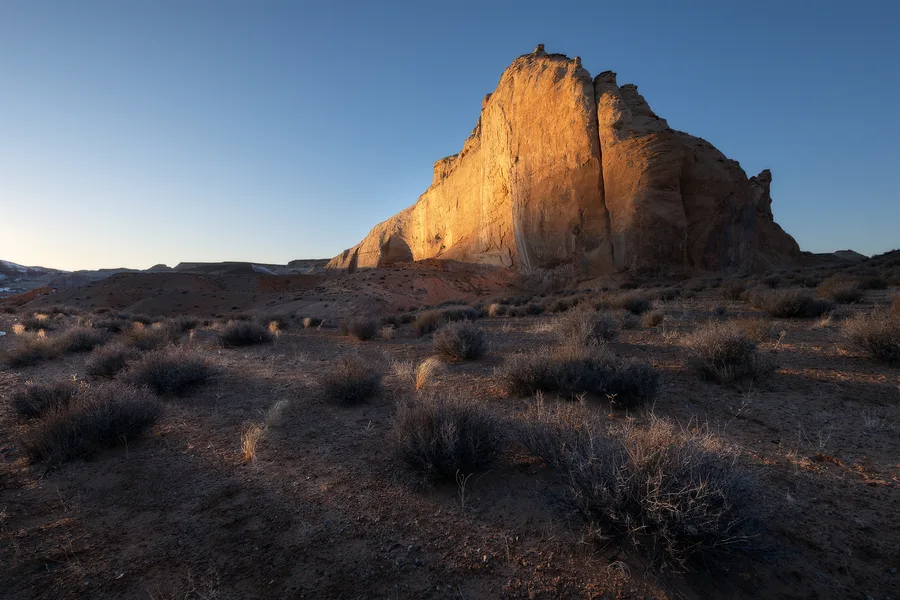
Backpacking Canyon Country, Utah.
Southwest Desert
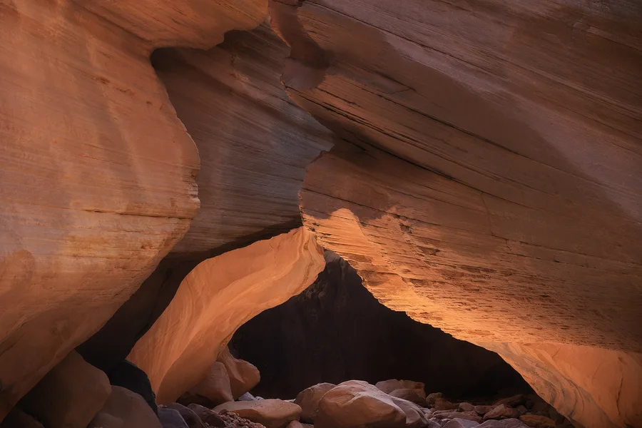
Canyon Country, Utah.
Silent Echoes
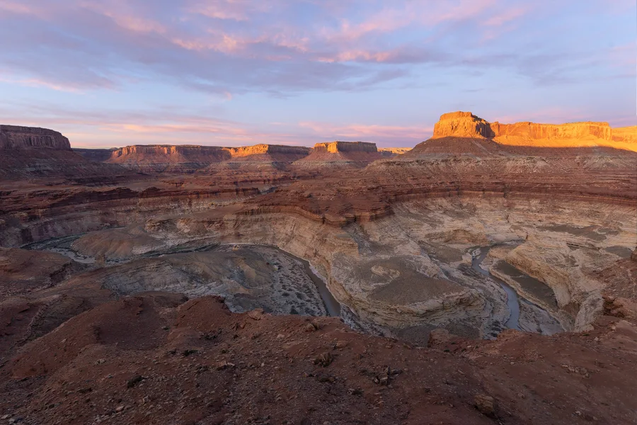
Southern Utah Wilderness.
Southwest Desert
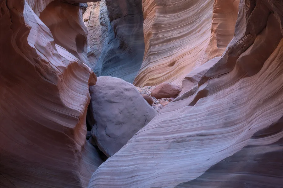
Canyon Country, Utah.
Silent Echoes
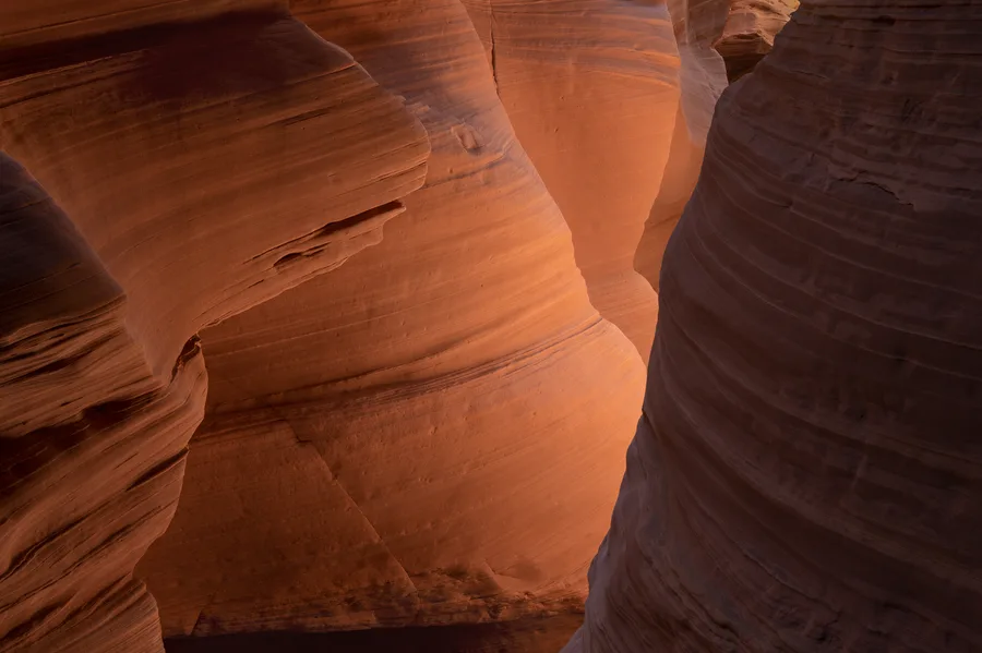
Canyon Country, Utah.
Silent Echoes
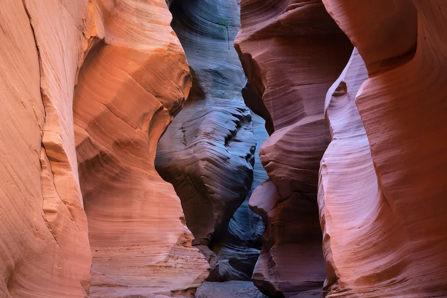
Canyon Country, Utah.
Silent Echoes
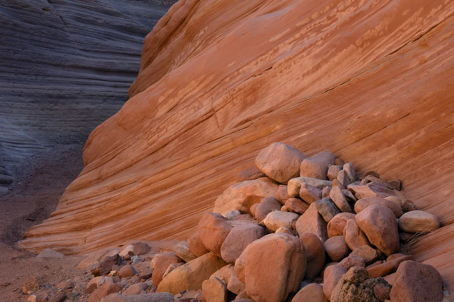
Canyon Country, Utah.
Silent Echoes
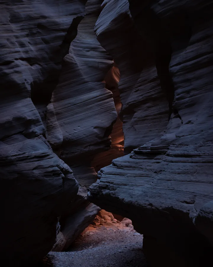
Canyon Country, Utah.
Silent Echoes
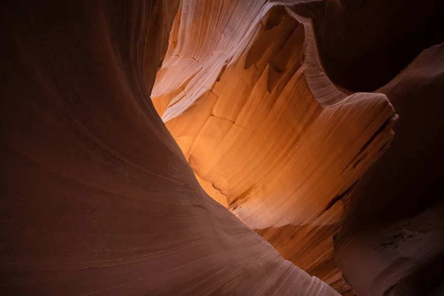
Canyon Country, Utah.
Silent Echoes
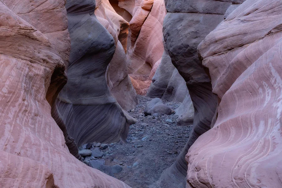
Canyon Country, Utah.
Silent Echoes
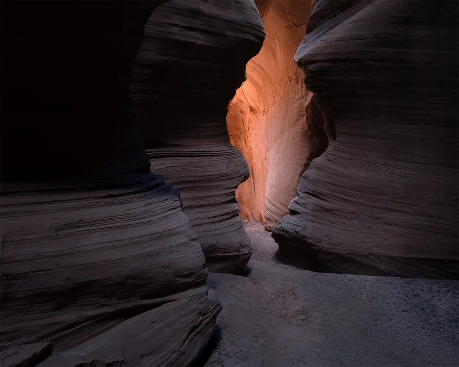
Canyon Country, Utah.
Silent Echoes
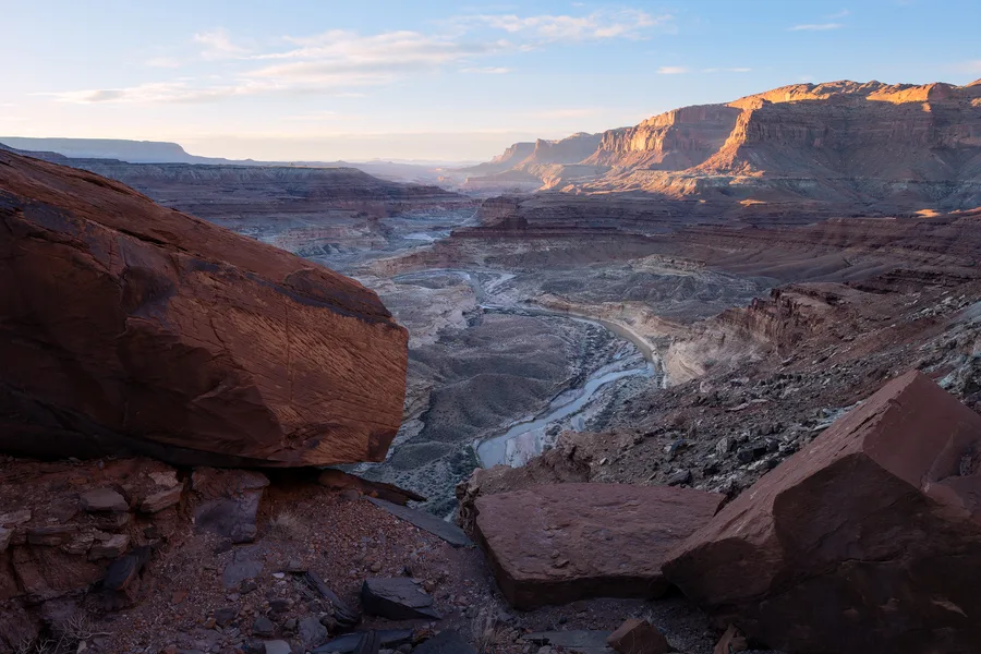
Canyon Country, Utah.
Southwest Desert
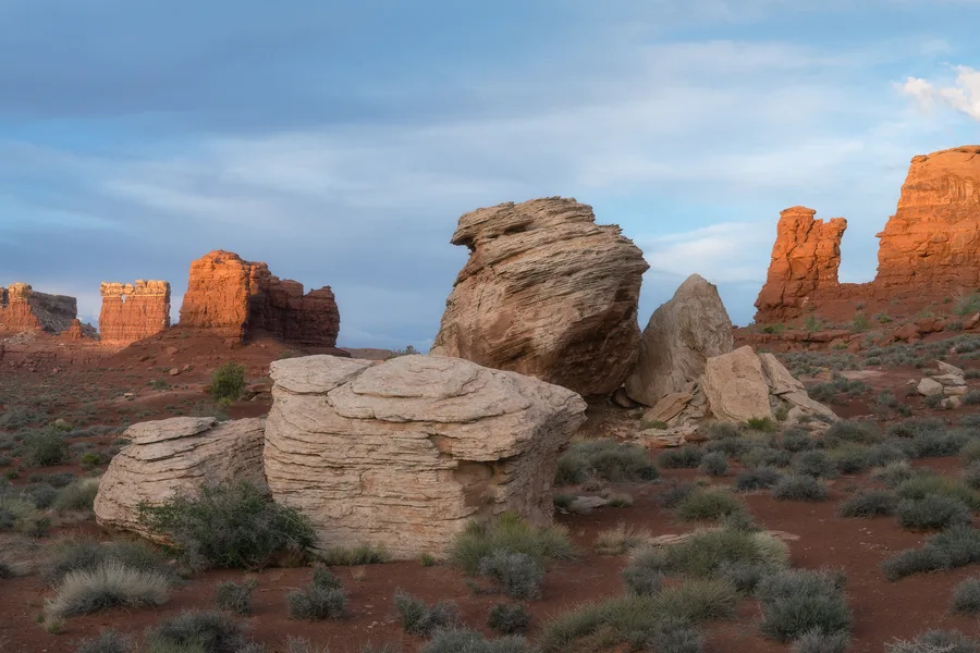
South-Central Utah.
Southwest Desert
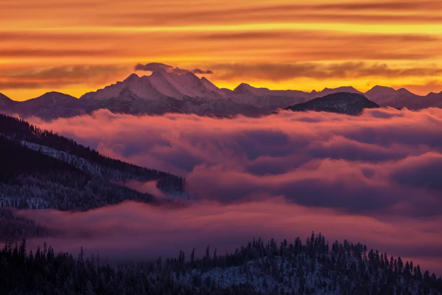
Mountain Landscapes
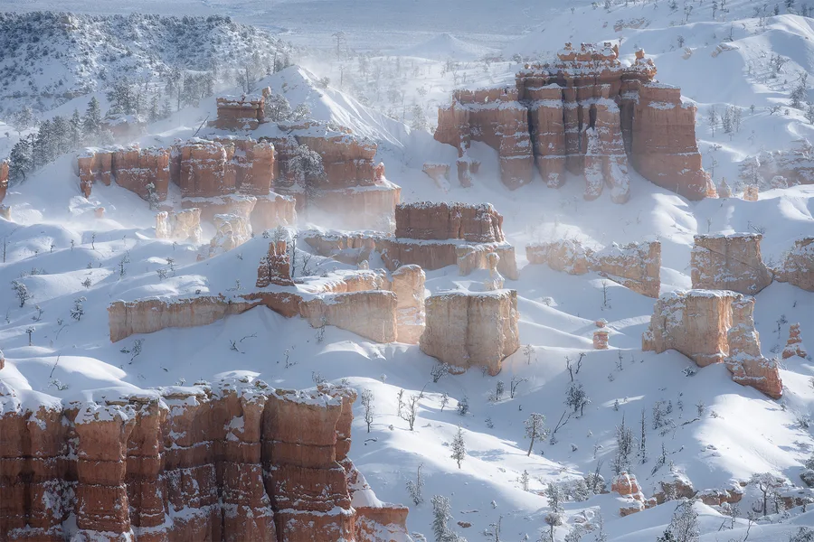
Bryce Canyon National Park, Utah. 2024
Winter Scenes
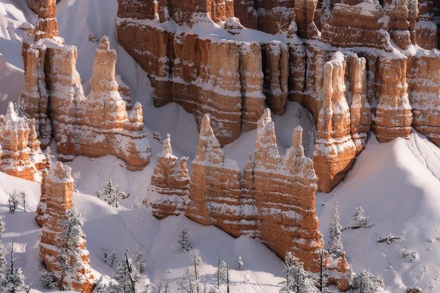
Bryce Canyon National Park, Utah. 2023
Winter Scenes
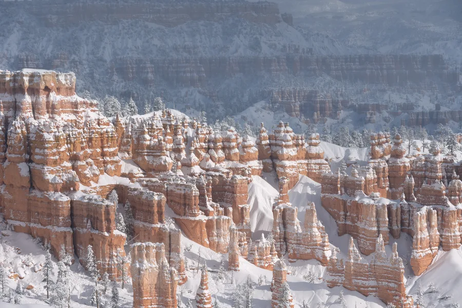
Bryce Canyon National Park, Utah. 2024
Winter Scenes
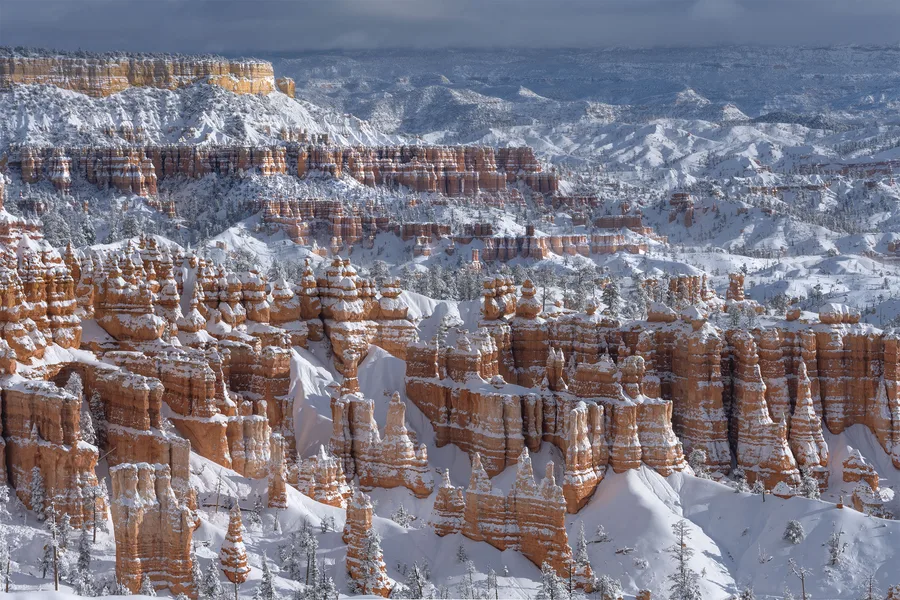
Bryce Canyon National Park, Utah. 2024
Winter Scenes
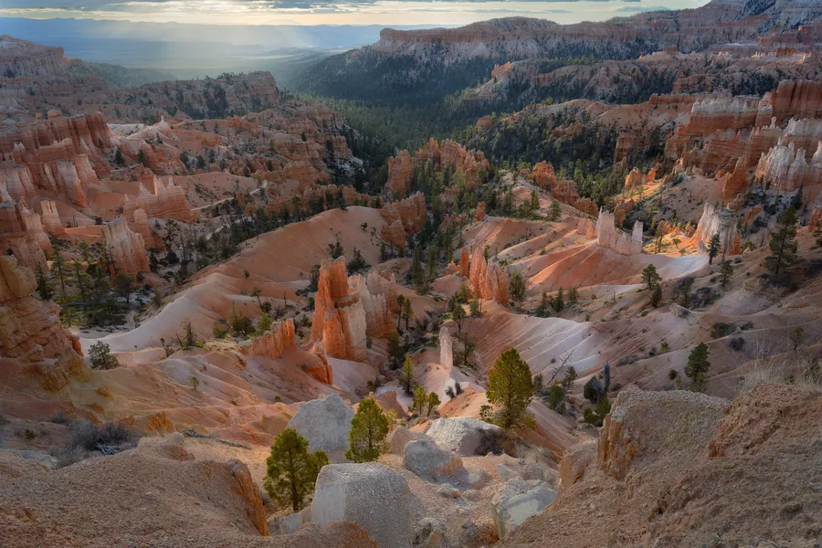
Bryce Canyon National Park, Utah. 2024
Southwest Desert
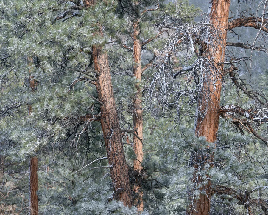
Fishlake National Forest, Utah. 2024
Winter Scenes
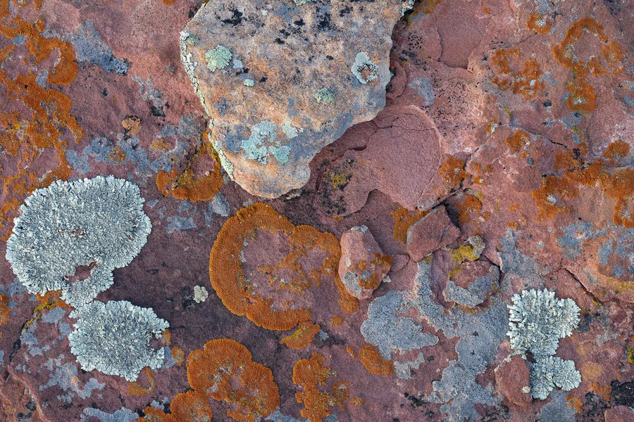
Capitol Reef National Park, Utah. 2025
Intimate Scenes
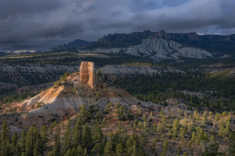
Dixie National Forest, Utah. 2025
Southwest Desert
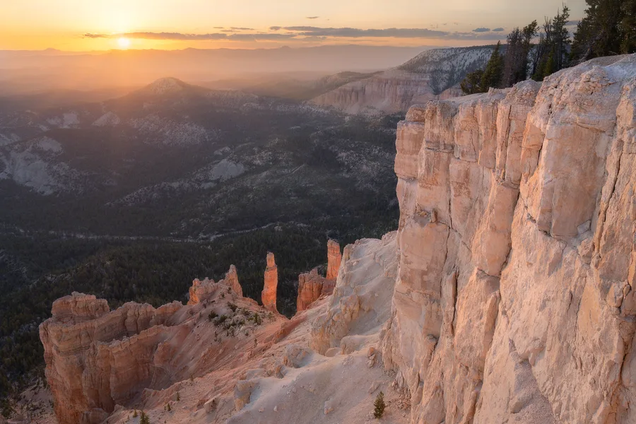
Dixie National Forest, Utah. 2025
Southwest Desert
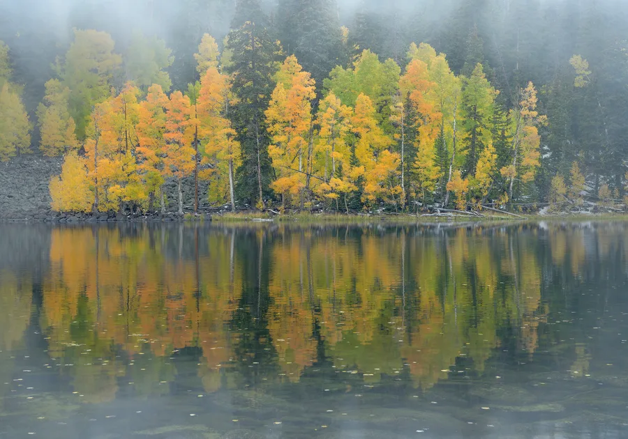
Fishlake National Forest, Utah. 2025
Autumn Colors
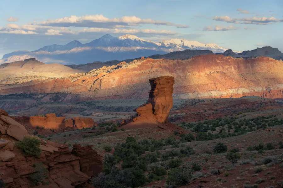
Capitol Reef National Park, Utah. 2025
Southwest Desert
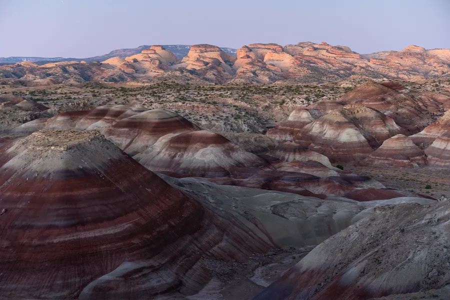
Capitol Reef National Park, Utah. 2024
Southwest Desert
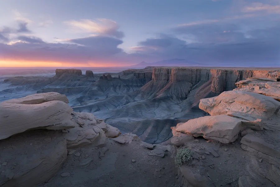
South-Central Utah. 2024
Southwest Desert
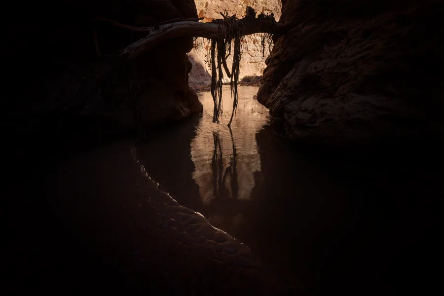
Capitol Reef National Park, Utah. 2025
Intimate Scenes
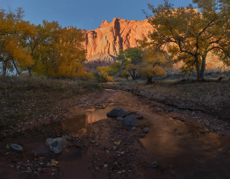
Capitol Reef National Park, Utah. 2025
Autumn Colors
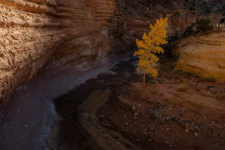
Capitol Reef National Park, Utah. 2025
Autumn Colors
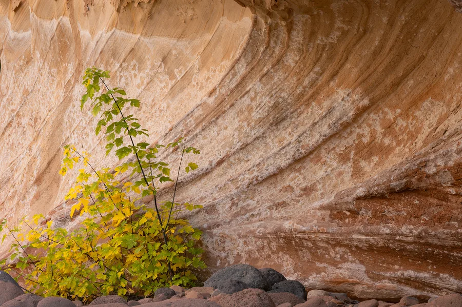
Capitol Reef National Park Fall. 2024
Autumn Colors
Project Guidance
Sometimes the right photograph begins with a feeling: calm blue water, golden autumn leaves, soft snow, desert texture, wildflowers, or a darker atmospheric scene. This search is designed for that kind of browsing, whether you are choosing artwork for a home, office, hospitality space, or healthcare environment.
Planning a professional interior? The resources at right cover healthcare, hospitality, corporate offices, color strategy, and trade projects in greater depth.
Homes, Offices, and Healing Spaces
Nature photography can do more than fill a wall. In waiting rooms, treatment spaces, offices, bedrooms, and shared gathering areas, color helps set the emotional tone before someone notices the specific subject of the photograph.
Cool blues, greens, mist, water, forests, and snow can soften anxiety and create a more settled atmosphere.
Search cool tonesYellow, orange, gold, flowers, and warm reflected light can bring lift and vitality to more active spaces.
Search warm tonesNeutral furniture and flooring can support almost any artwork, while existing accent colors can be echoed through targeted color searches.
Search neutralsColor and Atmosphere
Color is not only decoration. It can change the emotional temperature of a room, guide attention, and shape whether a photograph feels peaceful, energetic, intimate, or expansive.
Cool colors usually slow the eye down. Blue prints often work well in bedrooms, waiting rooms, offices, and quiet reading spaces because water, snow, twilight, and distant mountains can create a sense of calm and space. Green prints can feel restorative and grounded, making them a strong fit for living rooms, healthcare spaces, work areas, and rooms where you want nature to feel close.
Warm colors tend to bring more energy into a room. Gold, yellow, and orange can make entries, dining areas, kitchens, gathering spaces, and hospitality rooms feel brighter and more welcoming. Red has more visual weight, so it works best when you want a strong focal point: above a sofa, in a hallway, behind a reception desk, or anywhere the print is meant to hold attention.
Neutrals, whites, grays, and softer earth tones are useful when the room already has strong furniture, color, or pattern. They give the eye room to rest while still adding mood, texture, and a connection to the landscape.
Calm, spacious, and reflective.
Blue often feels cooling and expansive, which makes water, shadow, twilight, and distant mountains feel peaceful without becoming visually empty.
Search BlueRestorative, grounded, and alive.
Green is closely tied to growth and shelter. Forests, moss, spring foliage, and river corridors can make a room feel settled and quietly renewed.
Search GreenOptimistic, bright, and welcoming.
Yellow draws the eye quickly. Autumn leaves, wildflowers, and sunlit grasses can add warmth and a gentle sense of joy.
Search YellowWarm, energetic, and inviting.
Orange carries the heat of sunset, sandstone, and reflected desert light. It can make a space feel more social, intimate, and alive.
Search OrangeBold, passionate, and dramatic.
Red has visual weight. In landscape prints it can create a strong focal point through cliffs, autumn color, desert varnish, or intense evening light.
Search RedCreative, contemplative, and atmospheric.
Purple sits between warm and cool, so it can feel imaginative without being loud. It often appears in dusk, clouds, shadows, and alpine light.
Search PurpleGentle, hopeful, and soft.
Pink can soften a landscape while still adding color. Sunrise clouds, wildflowers, and reflected light can feel tender and quietly uplifting.
Search PinkClean, quiet, and spacious.
White gives the eye room to rest. Snow, mist, clouds, and pale stone can make a print feel minimal, airy, and peaceful.
Search WhiteStrong, elegant, and focused.
Black adds contrast and structure. Deep shadows, night skies, basalt, and dark trees can make surrounding light feel more luminous.
Search BlackBalanced, subtle, and timeless.
Gray can lower visual noise and let texture, shape, and mood lead. Storm light, stone, fog, and winter skies often work beautifully in quiet rooms.
Search GrayEarthy, stable, and natural.
Brown connects a print to wood, soil, bark, and stone. It can make a space feel warm, tactile, and grounded.
Search BrownRich, nostalgic, and luminous.
Gold often feels like late light: aspens, grasses, cottonwoods, and reflected sun. It brings warmth while still feeling natural.
Search GoldPrints, Field Notes & Workshops
Receive the free field guide, new print releases, workshop updates, and occasional notes from the landscape.
By joining, you agree to receive emails from Hunter Page Photography. Unsubscribe anytime.